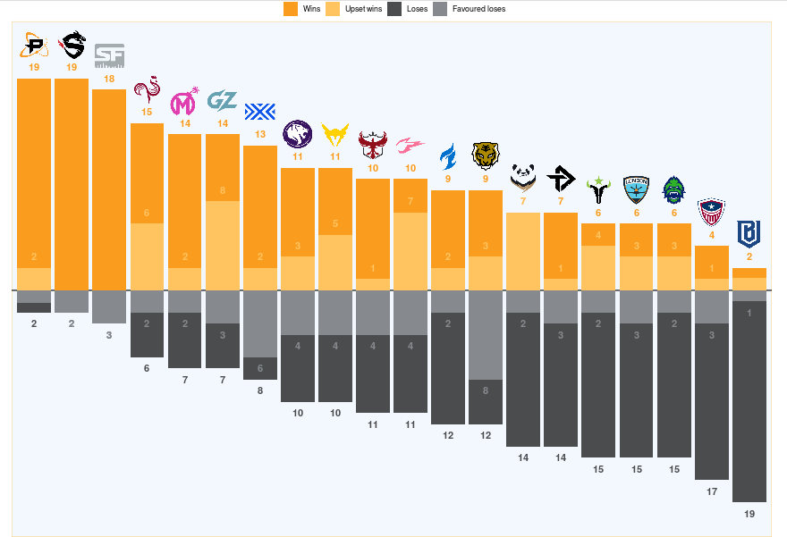
Season Summary vs Expectations
This summary from the Odds Portal Season Summary lets you quickly glance back at 2020's regular season winners and losers. Overlaid is how many of those wins and loses happened when they were favored or considered underdogs based on betting odds aggregated by the website OddsPortal.
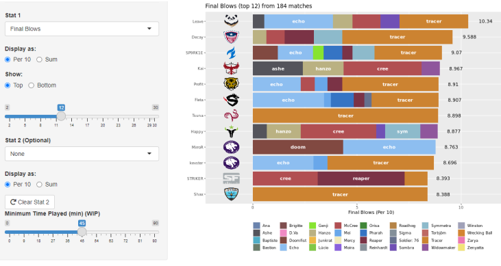
Stats Garage
This dashboard is part of Stats Garage; a tool meant to as a companion to the official Stats Lab. You can select from all the available statistics provided by the League; comparing performances from a single match, a number of matches or a team's whole season. (There are extra options like map selection missing from the screenshot)
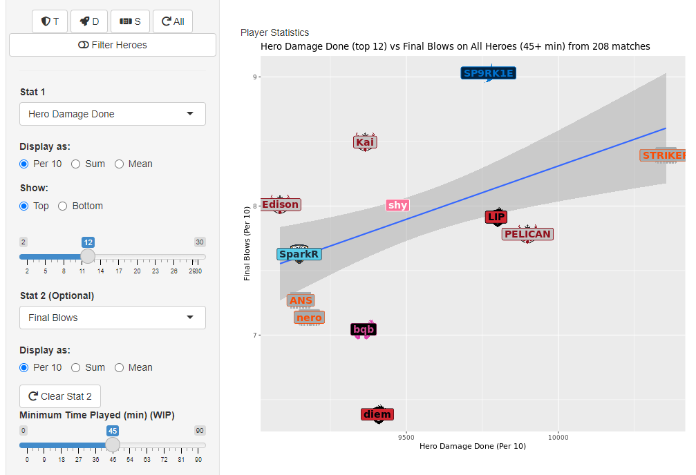
Stats Garage (cont)
The app also allows you to view a single statistic with a separate plot for more granular comparison.
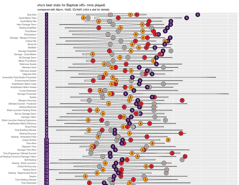
Player Profiler
The Player Profiler was built as a quick way to find out where any individual player excels and how they compare to peers in that category. Here we see from the numbers on the left that the main player being analyzed, shu, is ranked 1st in a 9 of the statistics collected. Among a few of those statistics, the player is well above the usual distribution.
Power Ranker
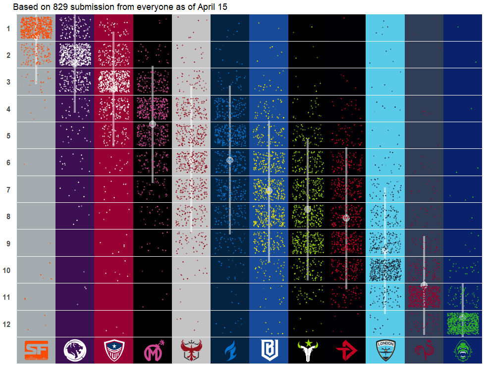
In an effort to aggregate community sentiment on the perceived strength of the teams in each of the 2 regions, I custom built a survey tool that let users rank teams as well as share their rankings in the form of links, graphics, and text. While not a visualization, the tool allowed me gather a large amount of data for the next visualization.
Community Sentiment Distribution
With the data collected from the Overwatch League Power Ranker in a database, I was able to aggregate the collective community sentiment on how the teams compare. The visualization provides a clear idea of which teams the community has clear consensus on (1st and 12th) and which teams are much more controversial (5th and 6th, 8th and 9th).
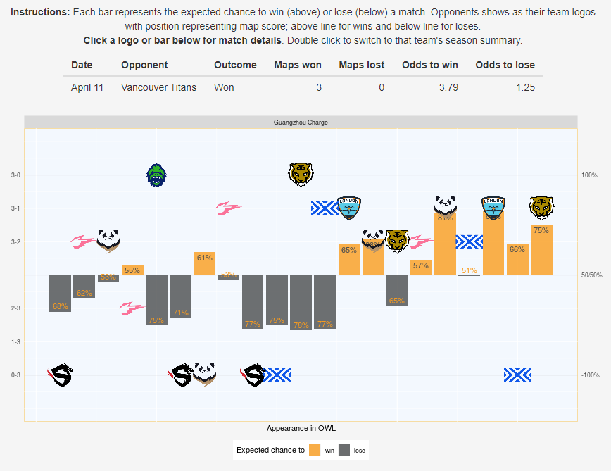
Team Season Summary and Expectations
To compliment the season summary for all teams, the Odds Portal Season Summary tool lets you see how each team performed across the season. The team logos represent the opponents faced; above the line representing a win and below, a loss. While the plot has a small learning curve, it provides a glance at both a team's performance and their expectations. In the tool, the plot also lets you click an opponent to get more information about that particular match in the table above. In the case of the team depicted in this plot, they're first half of the season had a lot of doubters even though they managed to win half the games; resetting their expectations for the latter half of the season.
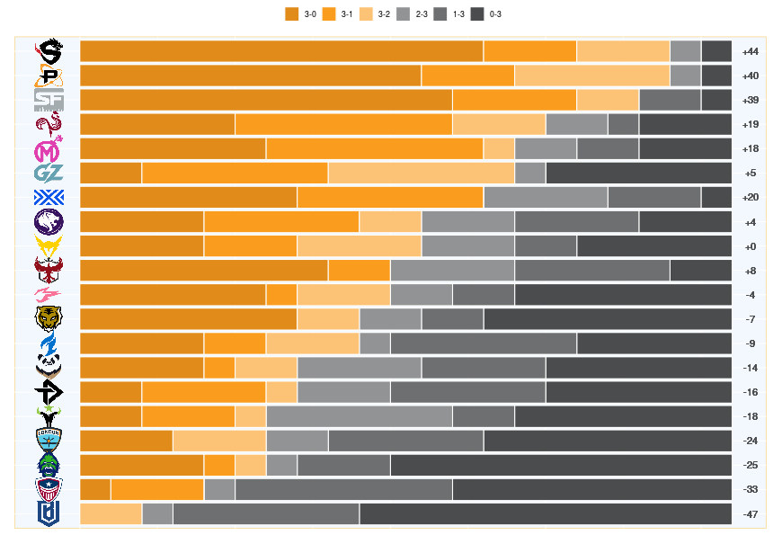
Match Performance Distribution
Another summary plot from the Odds Portal Season Summary, it displays the final map-score for each of the team's 21 regular season games at a glance. Though it's clear with their final win percentage, the size of the bars of the top 3 teams emphasize how dominant they were in the season; with significantly more 3-0s than the next team. Other teams of note are New York (7th) and Atlanta (10th) who never won in a close fashion and only ever as a 3-0 or 3-1. We can also see how different Houston's final season standing would have been with the difference of just a few maps given how many 2-3 losses they endured.
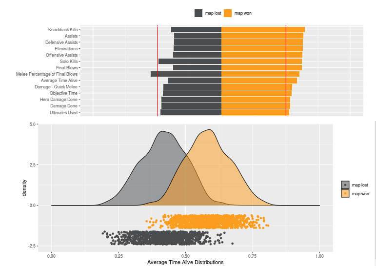
Logistic Regression Plot
A proof-of-concept meant to visually represent which published statistics were most relevant for a team to win a map. Available at Shinyapps. This visually shows how a logistic regression would collapse into the single number for each statistic as seen in the upper plot. The lower plot displays the associated distribution curves. Looking at the distribution of each statistic gives you a better picture how important it is and lets you guage whether teams are doing well or worse. The project was inspired by a blog post from one of the coaches in the League, IMT.
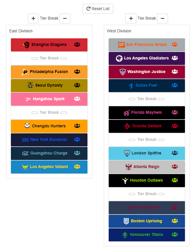
Off-Season Roster Tracker
The primary purpose for the Off-Season Tracker was to have a clear place to get up-to-date information of what players a team kept and to which team (if any) the rest were traded. The icons additionally show whether players were signed/let go from/into free agency or transfers or prior contracts.